# Layout with Flexbox
A component can specify the layout of its children using the Flexbox algorithm. Flexbox is designed to provide a consistent layout on different screen sizes.
You will normally use a combination of `flexDirection`, `alignItems`, and `justifyContent` to achieve the right layout.
> Flexbox works the same way in React Native as it does in CSS on the web, with a few exceptions. The defaults are different, with `flexDirection` defaulting to `column` instead of `row`, and the `flex` parameter only supporting a single number.
### Flex
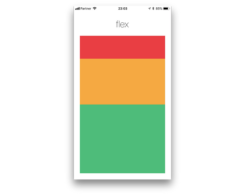
[`flex`](https://reactnative.dev/docs/layout-props#flex) will define how your items are going to **“fill”** over the available space along your main axis. Space will be divided according to each element's flex property.
In the following example, the red, yellow, and green views are all children in the container view that has `flex: 1` set. The red view uses `flex: 1` , the yellow view uses `flex: 2`, and the green view uses `flex: 3` . **1+2+3 = 6**, which means that the red view will get `1/6` of the space, the yellow `2/6` of the space, and the green `3/6` of the space.
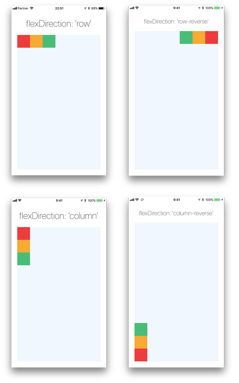
### Flex Direction
[`flexDirection`](https://reactnative.dev/docs/layout-props#flexdirection) controls the direction in which the children of a node are laid out. This is also referred to as the *main axis*. The cross axis is the axis perpendicular to the main axis, or the axis which the wrapping lines are laid out in.
* `row` Align children from left to right. If wrapping is enabled, then the next line will start under the first item on the left of the container.
* `column` (**default value**) Align children from top to bottom. If wrapping is enabled, then the next line will start to the right of the first item on the top of the container.
* `row-reverse` Align children from right to left. If wrapping is enabled, then the next line will start under the first item on the right of the container.
* `column-reverse` Align children from bottom to top. If wrapping is enabled, then the next line will start to the right of the first item on the bottom of the container.
You can learn more [here](https://yogalayout.com/docs/flex-direction).
```
import React from 'react';
import { View } from 'react-native';
const FlexDirectionBasics = () => {
return (
// Try setting `flexDirection` to `column`.
);
};
export default FlexDirectionBasics;
```
### Layout Direction
Layout direction specifies the direction in which children and text in a hierarchy should be laid out. Layout direction also affects what edge `start` and `end` refer to. By default, React Native lays out with LTR layout direction. In this mode `start` refers to left and `end` refers to right.
* `LTR` (**default value**) Text and children are laid out from left to right. Margin and padding applied to the start of an element are applied on the left side.
* `RTL` Text and children are laid out from right to left. Margin and padding applied to the start of an element are applied on the right side.
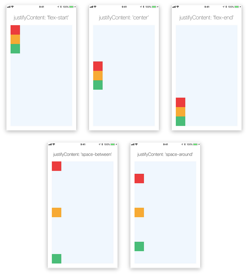
### Justify Content
[`justifyContent`](https://reactnative.dev/docs/layout-props#justifycontent) describes how to align children within the main axis of their container. For example, you can use this property to center a child horizontally within a container with `flexDirection` set to `row` or vertically within a container with `flexDirection` set to `column`.
* `flex-start`(**default value**) Align children of a container to the start of the container's main axis.
* `flex-end` Align children of a container to the end of the container's main axis.
* `center` Align children of a container in the center of the container's main axis.
* `space-between` Evenly space off children across the container's main axis, distributing the remaining space between the children.
* `space-around` Evenly space off children across the container's main axis, distributing the remaining space around the children. Compared to `space-between`, using `space-around` will result in space being distributed to the beginning of the first child and end of the last child.
* `space-evenly` Evenly distribute children within the alignment container along the main axis. The spacing between each pair of adjacent items, the main-start edge and the first item, and the main-end edge and the last item, are all exactly the same.
You can learn more [here](https://yogalayout.com/docs/justify-content).
```
import React from 'react';
import { View } from 'react-native';
const JustifyContentBasics = () => {
return (
// Try setting `justifyContent` to `center`.
// Try setting `flexDirection` to `row`.
);
};
export default JustifyContentBasics;
```
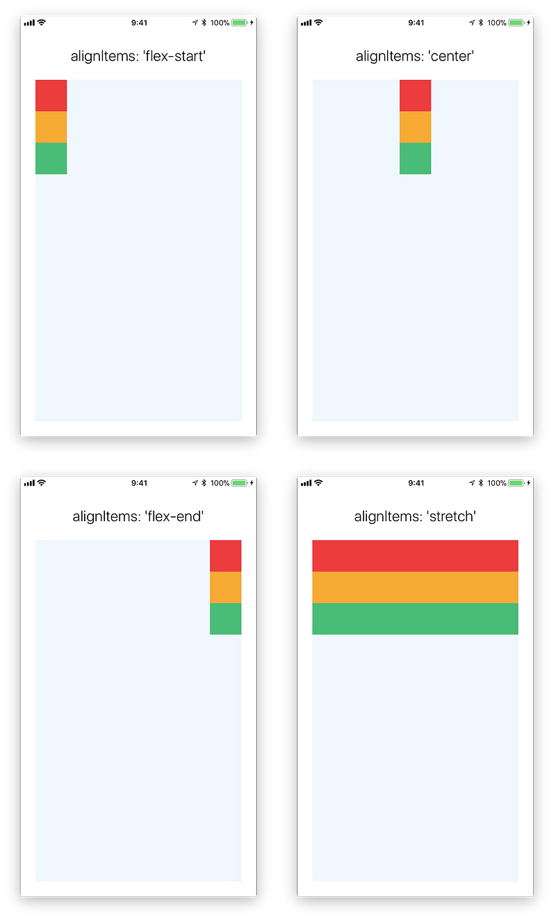
### Align Items
[`alignItems`](https://reactnative.dev/docs/layout-props#alignitems) describes how to align children along the cross axis of their container. Align items is very similar to `justifyContent` but instead of applying to the main axis, `alignItems` applies to the cross axis.
* `stretch` (**default value**) Stretch children of a container to match the `height` of the container's cross axis.
* `flex-start` Align children of a container to the start of the container's cross axis.
* `flex-end` Align children of a container to the end of the container's cross axis.
* `center` Align children of a container in the center of the container's cross axis.
* `baseline` Align children of a container along a common baseline. Individual children can be set to be the reference baseline for their parents.
> For `stretch` to have an effect, children must not have a fixed dimension along the secondary axis. In the following example, setting `alignItems: stretch` does nothing until the `width: 50` is removed from the children.
You can learn more [here](https://yogalayout.com/docs/align-items).
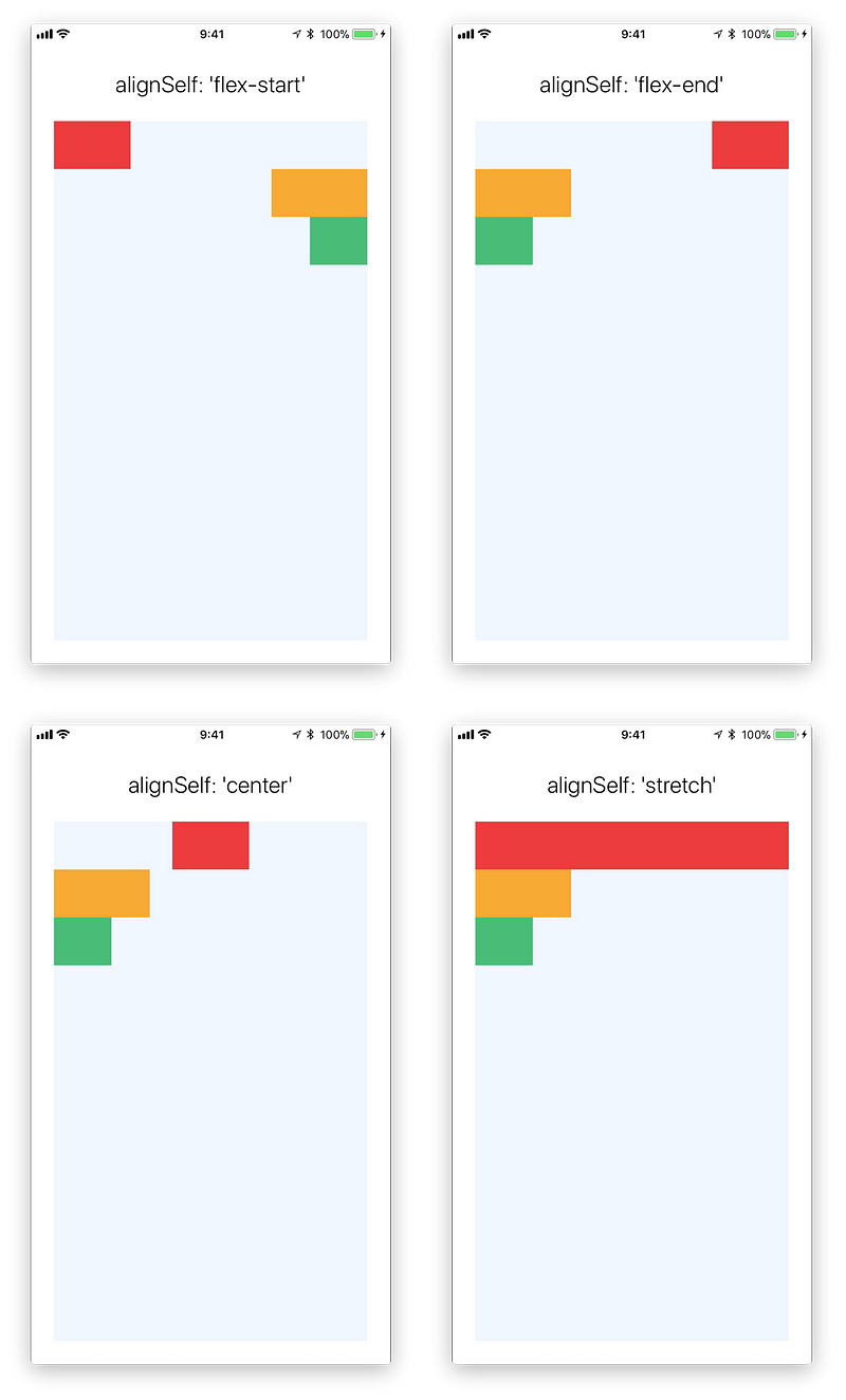
### Align Self
[`alignSelf`](https://reactnative.dev/docs/layout-props#alignself) has the same options and effect as `alignItems` but instead of affecting the children within a container, you can apply this property to a single child to change its alignment within its parent. `alignSelf` overrides any option set by the parent with `alignItems`.
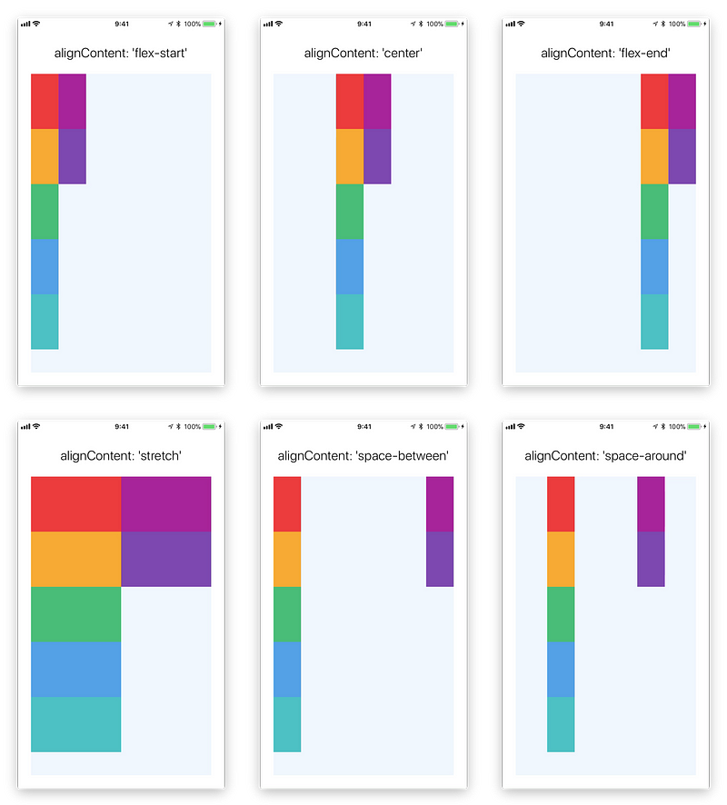
### Align Content
[alignContent](https://reactnative.dev/docs/layout-props#aligncontent) defines the distribution of lines along the cross-axis. This only has effect when items are wrapped to multiple lines using `flexWrap`.
* `flex-start` (**default value**) Align wrapped lines to the start of the container's cross axis.
* `flex-end` Align wrapped lines to the end of the container's cross axis.
* `stretch` Stretch wrapped lines to match the height of the container's cross axis.
* `center` Align wrapped lines in the center of the container's cross axis.
* `space-between` Evenly space wrapped lines across the container's main axis, distributing the remaining space between the lines.
* `space-around` Evenly space wrapped lines across the container's main axis, distributing the remaining space around the lines. Compared to `space-between`, using `space-around` will result in space being distributed to the beginning of the first line and the end of the last line.
You can learn more [here](https://yogalayout.com/docs/align-content).
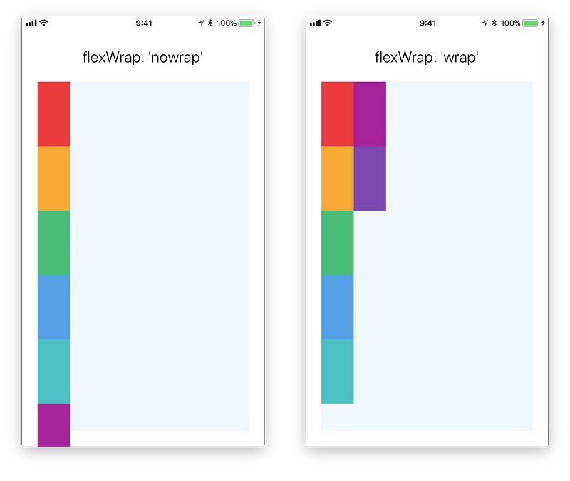
### Flex Wrap
The [`flexWrap`](https://reactnative.dev/docs/layout-props#flexwrap) property is set on containers and it controls what happens when children overflow the size of the container along the main axis. By default, children are forced into a single line (which can shrink elements). If wrapping is allowed, items are wrapped into multiple lines along the main axis if needed.
When wrapping lines, `alignContent` can be used to specify how the lines are placed in the container. Learn more [here](https://yogalayout.com/docs/flex-wrap).
### Flex Basis, Grow, and Shrink
* [`flexGrow`](https://reactnative.dev/docs/layout-props#flexgrow) describes how any space within a container should be distributed among its children along the main axis. After laying out its children, a container will distribute any remaining space according to the flex grow values specified by its children.
`flexGrow` accepts any floating point value >= 0, with 0 being the default value. A container will distribute any remaining space among its children weighted by the children’s `flexGrow` values.
* [`flexShrink`](https://reactnative.dev/docs/layout-props#flexshrink) describes how to shrink children along the main axis in the case in which the total size of the children overflows the size of the container on the main axis. `flexShrink` is very similar to `flexGrow` and can be thought of in the same way if any overflowing size is considered to be negative remaining space. These two properties also work well together by allowing children to grow and shrink as needed.
`flexShrink` accepts any floating point value >= 0, with 1 being the default value. A container will shrink its children weighted by the children’s `flexShrink` values.
* [`flexBasis`](https://reactnative.dev/docs/layout-props#flexbasis) is an axis-independent way of providing the default size of an item along the main axis. Setting the `flexBasis` of a child is similar to setting the `width` of that child if its parent is a container with `flexDirection: row` or setting the `height` of a child if its parent is a container with `flexDirection: column`. The `flexBasis` of an item is the default size of that item, the size of the item before any `flexGrow` and `flexShrink` calculations are performed.
You can learn more [here](https://yogalayout.com/docs/flex).
### Width and Height
The `width` property specifies the width of an element's content area. Similarly, the `height` property specifies the height of an element's content area.
Both `width` and `height` can take the following values:
* `auto` (**default value**) React Native calculates the width/height for the element based on its content, whether that is other children, text, or an image.
* `pixels` Defines the width/height in absolute pixels. Depending on other styles set on the component, this may or may not be the final dimension of the node.
* `percentage` Defines the width or height in percentage of its parent's width or height, respectively.
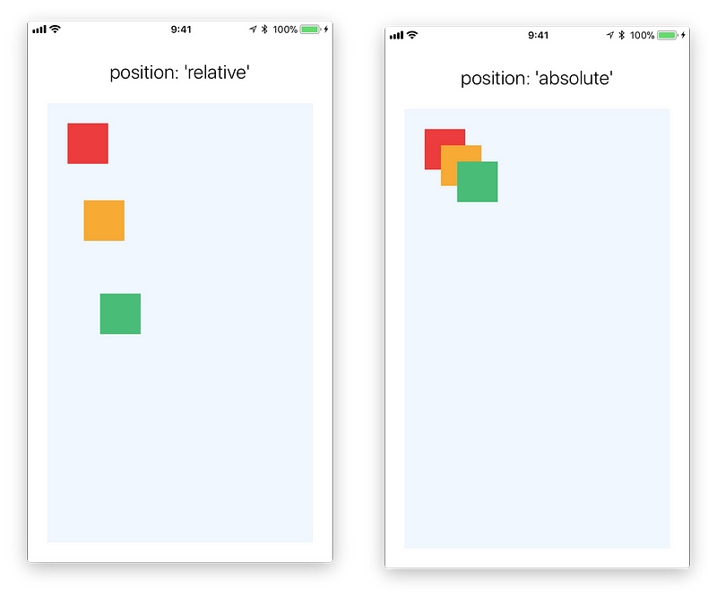
### Absolute & Relative Layout
The `position` type of an element defines how it is positioned within its parent.
* `relative` (**default value**) By default, an element is positioned relatively. This means an element is positioned according to the normal flow of the layout, and then offset relative to that position based on the values of `top`, `right`, `bottom`, and `left`. The offset does not affect the position of any sibling or parent elements.
* `absolute` When positioned absolutely, an element doesn't take part in the normal layout flow. It is instead laid out independent of its siblings. The position is determined based on the `top`, `right`, `bottom`, and `left` values.
### Going Deeper
---
# Agent Instructions: Querying This Documentation
If you need additional information that is not directly available in this page, you can query the documentation dynamically by asking a question.
Perform an HTTP GET request on the current page URL with the `ask` query parameter:
```
GET https://tkssharma.gitbook.io/react-training/react-native-core-fundamental/layout-with-flexbox.md?ask=
```
The question should be specific, self-contained, and written in natural language.
The response will contain a direct answer to the question and relevant excerpts and sources from the documentation.
Use this mechanism when the answer is not explicitly present in the current page, you need clarification or additional context, or you want to retrieve related documentation sections.